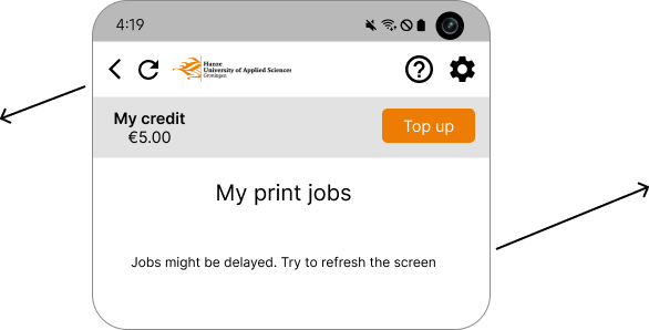
Who and What?

CampusPrint is an application that greatly simplifies the process of printing on Campus. This project was done for Canon Nederlands during my internship.

My impact

The redesign I created greatly reduces the average time the user takes to perform the essential tasks and brings the task success rate to 100%. The data is based on two usability tests performed prior and after the redesign.

Table with data about improvement

but how?

Diagnosing the problem

Because it was essential to understand what is the current user opinion of the application, I interviewed the person responsible for assisting students with printing and performed an usability test with 10 members of the target audience.

And successfully found the main frustrations of the user:

Creative solutions to technical challenges

One of the biggest challenges with this project were the technical and budget limitations. Due to the way the application was built, some of the usability issues were unavoidable, and the solutions had to be easy to implement to keep costs low. Thus, I had to come up with multiple solutions for each problem and present them to the stakeholders before proceeding.

One of the most confusing issues was the existence of a delay between uploading your files to the application and being able to select them to be printed. There was no warning of the delay, and the only way to refresh was to close and reopen the window. This usability issue greatly increased the average time it took to print and caused frustration.

Other fixes

Let me explain

Adding explanations for potentially unknown terms

conventions

UX conventions

Previously, the settings page also contained information on how to use the application and FAQ . I made use of pre-established UX conventions and added a shortcut icon to the information (how to page), and the refresh button mentioned above.

Miller's Law

Nobody likes having to remember things!The guide on how to scan is readily available in the scan section of the application at all times to reduce the cognitive load of the user

Find an answer quickly

Since the guides on how to print are written by the universities on a separate website, I created a page with shortcuts to the information


Separation

The nature of the application allows clients the ability to turn off certain features they do not want. This means that if the University decides to not pay for scan, the scan feature will not exist in their menu, which leaves the application feeling empty, and some buttons taking up too much space. This was important to keep in mind when iterating on the variations of the main page

Final thoughts

The documentation of the redesign and some ideas were taken by the company Canon outsources their software from. They iterated upon it and a CampusPrint redesign is now live.

Back home
Want to see more?
Next Project